
How to Avoid Bad User Design on Your Website
Your users visit your site to learn about your company, use a service your company provides, or make a purchase. Good user design (sometimes called UX) balances eye-catching style with guidance to the user’s destination. Bad user design, whether flashy or bland, obstructs the user’s journey.
Beyond intruding on the customer journey, bad user design negatively affects search engine optimization and site accessibility. While a search engine may not understand why a site’s design is good or bad, it can tell if users bounce from a website after a single pageview, which typically indicates poor UX. Bad design can create a downward spiral of declining engagement, lowering your site’s search engine ranking and reducing how many people can find it.
With all that being said, avoiding bad UX can be challenging, especially because it’s easy for bad patterns to creep in as your site evolves. When you’re updating your website or building a new one, keep these best practices in mind:
Keep Important Service & Product Pages in the Main Nav
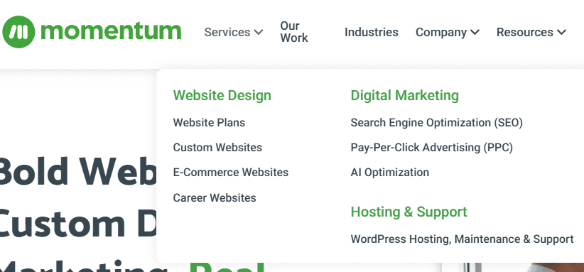
Good user design streamlines the customer journey, starting with making it easy to find the information they are seeking.
User Priority & Over-Choice
Your site’s main navigation should prioritize what your customers are looking for, not what you want them to find. If your site primarily sells products, start with your shopping experience, not your “about the company” links.
Strong user choice is always mindful of “over-choice” in site navigation design. Generally speaking, 5-7 top-level links is about as many as you can get away with before overwhelming the user with options. When you provide too many options, people will read the first few and ignore the rest. With 5-7 options, traffic splits somewhat evenly between sections. As you increase the number beyond 7, the first few options will get disproportionately more traffic. When you offer more than 20 options, anything after the fourth position will likely receive little to no interaction.
Navigation depth should be rectangular, not square. Either have a large number of top-level navigation sections with short drop menus that break out sections or have a few top-level navigation links with larger drop menus. Do not do both at the same time; a site with many top-level navigation links and larger sub-navigation drop menus creates a “square-shaped” navigation experience that is difficult for users to navigate.
Footer Navigation & Second Chances
Your site’s footer navigation should work collaboratively with the main navigation. This is where you can store links to essential content, such as company history pages, that customers aren’t typically looking for. Additionally, a site footer can repeat main navigation information with a more robust sitemap-style navigation. That way, if someone doesn’t find what they’re looking for on a page or within the main navigation, you have another opportunity to re-engage with them.
Minimized Gated Content
Strong user design makes it easy to find important information without creating discoverability or usability barriers. Sites that put up accessibility walls and gate content to encourage a more engaged user experience sometimes achieve exactly the opposite.
User acceptance testing, which involves business owners and actual users running through real-use-style interactions on a site, is a great way to ensure that your content is accessible. An example test might be: “Search the website for widget product #1 and find its dimensions on the product detail page.” If the test subjects find that information, whether it’s in an accordion, modal, or exposed on the page, the test succeeds. If they struggle to find the information, the user design has gated the content and needs to be reworked.
You don’t have to remove gated content or avoid it altogether. Gated content can work, but if you’re blocking essential information that aids in the customer journey, that potential buyer could end up choosing one of your competitors instead of you, simply because they didn’t have the information they needed when comparing potential businesses.
Understand Color Contrast
Does it hurt a little bit to read this?
The contrast between the background design and the foreground text needs to be high enough for people to read. The Web Content Accessibility Guidelines define the minimum acceptable color contrast levels a site can use between backgrounds and foreground text to comply with accessibility standards, regardless of where the site operates.
To be compliant, site text needs to be visible to all users, and poor contrast ratios can make text unreadable or difficult to read. Your business can use tools to verify whether text meets contrast ratio requirements.
Don’t Integrate Elements That Inhibit Clicking
Be deliberate when using pop-ups or chatbots, especially with mobile users. For example, a pop-up or chatbot that automatically expands to take up the entire page interferes with the user experience and very often causes readers to abandon the website altogether.
If you are using pop-ups for email collection or promotions, wait to verify that a user has an active session before launching them, and make sure they are easy to close. Asking a user to sign up for your email list after a third or fourth product view is much more likely to get them to actually join your list compared to bombarding them as soon as they visit a landing page or your homepage.
Not Balancing Content & Design
Site layouts go hand in hand with breaking down site content in a way that makes it easier for visitors to interpret. Design and content work best when considered together, rather than developed in silos and then mashed into the final product. If you don’t consider these two together, you can end up with “wall of text” content or a design that breaks up content that should be together.
Limit Animations or Moving Elements
From a design and development standpoint, using animations and moving elements in elaborate ways is a way to impress with technical and artistic expertise. However, from a user design standpoint, overusing animation and motion quickly transitions from “WOW!” to “Please get out of my way and let me use your site.” For example, embedded videos in headers can be distracting and intrusive. At the end of the day, your website’s purpose is to engage with your customers, not impress them with technical design expertise.
Animation, moving elements, and embedded video content can be difficult to gauge from the design alone. Gathering user interaction data through A/B testing with these features on and off is an effective way to measure whether they’re intruding or enhancing the user experience.
Ensure Headings & Subheadings Are Clear
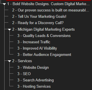
Headings and subheadings provide a natural table of contents on a webpage and greatly enhance content discoverability when used correctly. If you’re not a web designer or programmer and have ever edited website content through a WYSIWYG editor, you probably noticed you can alter text appearance with a “heading” option. Although headings apply stylistic changes to text, they also serve an information architecture purpose that helps users navigate your content and helps search engines properly interpret your pages.
Headings and subheadings break apart content sections to make them easy to digest and provide guidance on how sections relate to one another. The page title uses “Heading 1.” From there, subheadings “Heading 2” through “Heading 6” let you define which content falls under which sections. Do not use headings solely for styling text. If “Heading 5” appears larger than “Heading 3,” that is a problem with the site’s styling.
Keep Mobile Responsiveness In Mind


Mobile devices typically account for up to 63% of all website traffic, and this can be a problem for web design because people create, preview, and test websites on desktop computers, which offer a very different experience from smartphones. However, creating two different websites for mobile and desktop use is an inefficient use of development and maintenance resources. “Responsive Design” is the solution to this problem, which involves creating a website that adjusts its layout and user design depending on the size of the user’s device screen.
When designing and developing your website content, it’s important to keep mobile and desktop responsiveness in mind and pay attention to how the content will flow across all devices. A website that’s not designed for mobile devices may require the user to zoom to read content or hinder them from using navigation features that only react to hover or mouse-over interaction. In some cases, important content may get cut off to fit onto the mobile device.
Partner With an Experienced Web Design & Development Agency
The power of a good website cannot be understated. Momentum has been building responsive websites since 2010, and a strategic website redesign can help increase organic traffic, improve search visibility and rankings, and be a stepping stone to more (and better) leads.
If you’ve noticed a decline in website performance, contact us today to schedule a free website review, where we’ll provide insights into what user design improvements you could benefit the most from.
