
“I Just Want Something That Stands Out”: Elements That Make a Bold Website Design
Creating what constitutes ‘good’ web design is a challenging proposition. People get caught up in the aesthetics, but forget that a website must also balance functionality, performance, and accessibility. We’ve all visited a website at some point that initially impressed us with cool graphics and animation techniques, but quickly left us underwhelmed when we realized how much of a chore it was to use that website to accomplish whatever we came there to do. On the other side of the spectrum, we’ve visited a brilliantly decorated website that’s a breeze to use and seems effortlessly designed.
The reality is, the latter site took an incredible amount of effort to create, starting with content-focused, user-experience-prioritized planning.
Defining “Bold”
A truly bold website design stands out by successfully blending strong visuals, functionality, and user experience into a cohesive whole.
Let’s use Leonardo da Vinci’s Mona Lisa as an example. We know you’re probably like “What? What does the Mona Lisa have to do with website design?” But stay with us. When it comes down to it, the Mona Lisa is a small portrait of a “normal” woman in front of a common landscape. It’s not depicting some important historical event, historical figure, or an epic mythical scene. The painting’s topic or theme is as normal as it gets. Good, thoughtful design in essential areas transformed the Mona Lisa into a revered masterpiece. While that’s a high standard, it exemplifies how a website can become memorable when it prioritizes functionality first, building visual appeal on this foundation. Memorable design doesn’t need to be epic. It should serve the project’s purpose. Visual aesthetics matter most in first impressions, but represent only a fraction of a well-designed site.
TL;DR: You need to worry about functionality, performance, and accessibility, not just aesthetics.
With that being said, there are a few elements we love that help create that balance that makes a website design truly bold.
Before & After Sliders
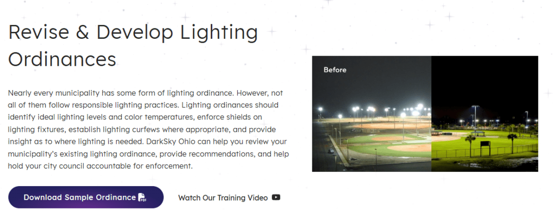
A “Before & After” slider provides site visitors with an intuitive way to compare two similar images. These sliders work by overlaying one image on another and using a bar or button to control how much of each image is shown. They can aid both storytelling and comparison and can look striking when used appropriately.
Some of the many comparisons a slider can elevate are:
- Comparing a room remodel before and after.
- Showing what a building or street looked like years apart.
- Demonstrating the effects of something like artificial lighting, medicine, clothes, or makeup on a person.
- Wowing potential customers with how much better a dog looks after a grooming appointment.
Patterned Sections

As websites evolve alongside businesses, there is often a need to build new content and landing pages for new products, services, or promotions. Starting from scratch each time can quickly lead to an inconsistent site that loses the benefits of good design. Patterned sections address this by creating reusable blocks that integrate new content into pre-approved designs. With patterned sections, sites can break design into components, offering a toolkit of designs for new content. For example, a gallery or testimonial block can appear across multiple pages while maintaining brand consistency. Patterned sections also support user accessibility by standardizing layout and interaction.
Interactive Icons & Buttons
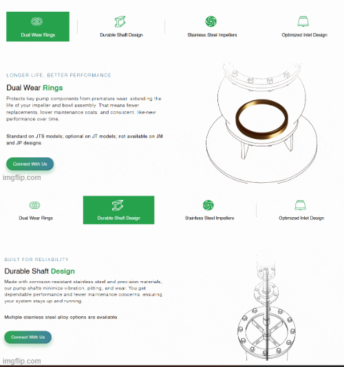
Consistent use of interactive iconography and buttons plays a significant role in effective web design. Buttons and icons are key to the user interface and appear on every page, making them important in establishing brand tone through color, typography, and style. These elements also respond to user actions, such as mouseovers, taps, and clicks, providing opportunities for subtle design flourishes that don’t distract from the page’s purpose. Button color can create a visual hierarchy to indicate importance. Icons and buttons clearly and efficiently communicate usage, such as social media logos linking to brand accounts.
Scrolling Testimonials
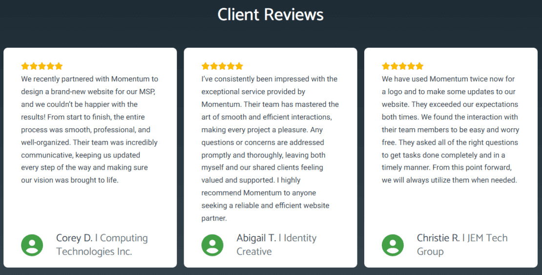
Customer reviews can help a business build credibility with their audience, but presenting too many at once may overwhelm visitors. Scrolling testimonials provide an effective solution by showcasing a single review that encourages visitors to click or scroll through a series of concise, digestible testimonials. This approach promotes active engagement with the content. When guests interact with the testimonial module, automatic scrolling should stop, and any movement or animation should prioritize smoothness and usability over visual effects.
Embracing Whitespace
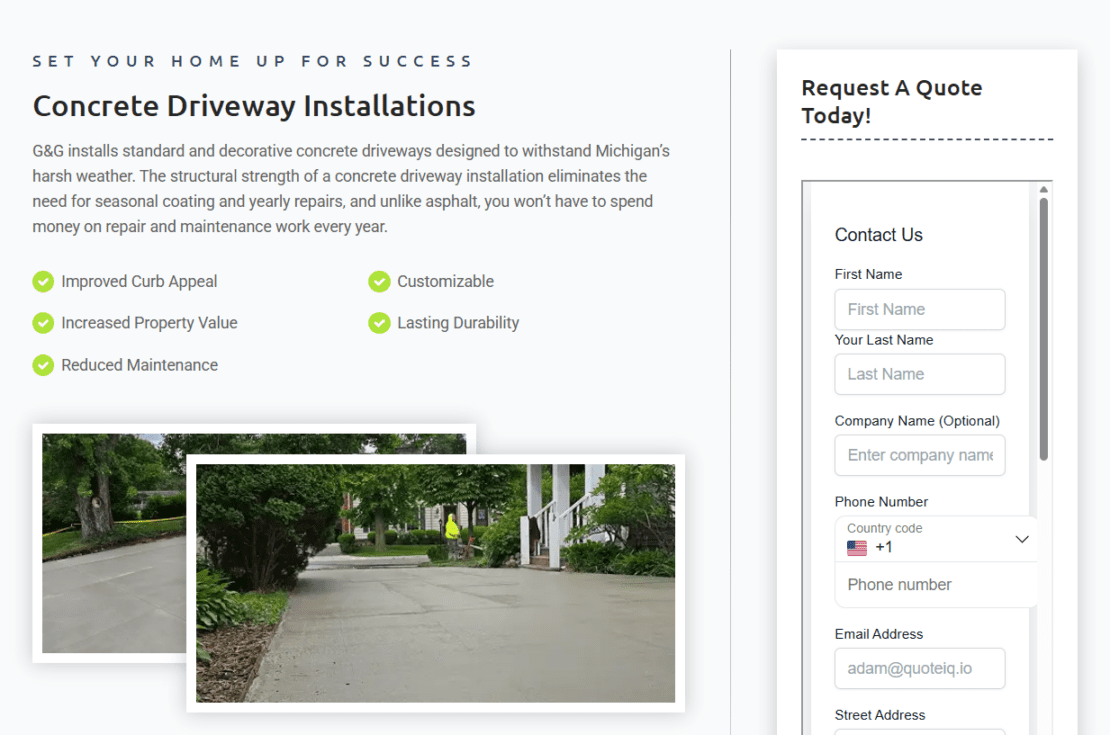
Whitespace, the empty space on a page, seems simple but is challenging to use well. Used right, it guides visitors and emphasizes key content, although it often goes unnoticed. People focus on content, but whitespace improves readability and balances the layout. Even without design experience, you notice the effect of whitespace.
Mega Menus
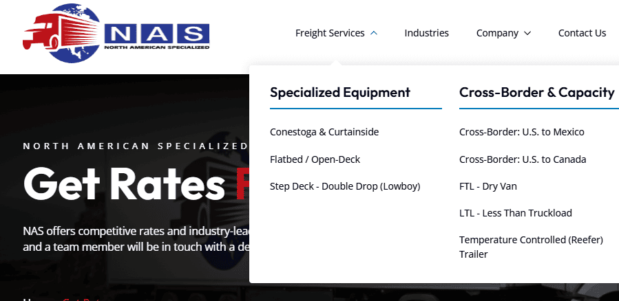
Mega menus offer solutions for sites with complex structures, such as those featuring multiple pages, content categories, or product lines. Unlike simpler navigation, which arranges links in a single row or column, a mega menu organizes information in a two-dimensional layout for easy browsing. For instance, a travel site can group cities by region, helping users find destinations without lengthy lists. This approach streamlines navigation for users seeking specific content areas.
Attracting Users Takes More Than Design
The terms User Interface and User Experience are often conflated, but they represent distinct website design concepts: UI determines how a site looks, while UX focuses on how it functions. Flashy, eye-catching UI attracts initial attention, but thoughtful UX keeps users engaged. Like whitespace, some UX features are nearly invisible and simply make a site feel easy or difficult to use, even if visitors can’t articulate why. Others are more prominent, immediately signaling the site’s usability.
The UX discipline pays close attention to the following:
Page Speed
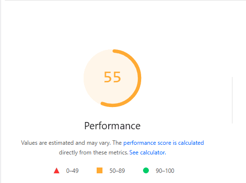
Users appreciate a website that loads rapidly and feels responsive. Large media and excessive content can slow page load times, risking user abandonment. Remember that many visitors use older devices and have slower connections.
Accessibility
Accessibility is essential, and some visual or interactive barriers drive users away. Flashy backgrounds and complex animations can hurt usability. For example, a pest control site may use moving spiders, which attract attention but hinder readability. Sites must meet WCAG guidelines to comply with laws regarding color, font, animation, and keyboard navigation.
Responsiveness
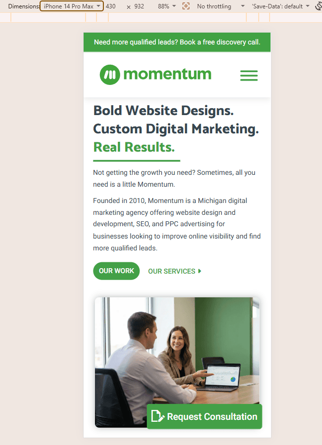
Developers build sites on computers, but most visitors use phones. This focus on desktop-first design often neglects mobile. A good website never sacrifices content or features for mobile users.
Content Hierarchy
One of the invisible elements of strong web design is the deliberate structuring of a website to direct visitor attention to the most important concepts and messages. When it comes to website design that stands out, decoration is about more than looking cool; it’s about guiding visitors through the content hierarchy.
Removing Barriers
Even the best, most thoughtful website design is meaningless if the site has barriers, including annoying pop-ups that are hard to close or that bombard the reader on every page load. Animations and scrolling effects may look really neat, but it’s easy to overdo them and change a visitor’s opinion from “wow” to “please get on with it.”
If your site is using a pop-up to capture email leads or offer a promotion, it’s better to wait until a visitor has engaged with your content to elevate these messages by asking once after a certain number of page views or time on page. Animations and scrolling effects should be subtle enough that they don’t add a noticeable amount of time to read a given page.
Starting With a Mockup
Bold website design doesn’t start by throwing pages together haphazardly; it starts with high-quality mockups and prototypes. Mockups are especially crucial for businesses that don’t really know what their website should look like or what content should appear on it.
If you need to build a website but have no idea where to start, schedule a consultation with Momentum. We have more than 15 years of experience designing websites and building digital marketing campaigns for businesses in industries ranging from manufacturing and transportation to wellness and hospitality. We offer several flexible website plans, each of which includes one or more mockups, to ensure we find a design that works for your brand and your audience.
Visit our website to explore our plans, or schedule a free website review and discovery call today.
