The 10 Most Common Mistakes Businesses Make During Their First Website Build or Rebuild
Whether you own a small local business or a nationwide company, having an online presence is no longer an option—it’s a necessity. Consider a website as a virtual front door to your business—it’s how your audience will perceive and engage with your brand.
Although websites are a necessity, you should still emphasize quality over speed. Building (or rebuilding) a website takes time, and there are plenty of challenges to overcome. Proper planning, strategic thinking, and understanding the nuances of web design are essential to avoid pitfalls that can turn an exciting venture into a cumbersome ordeal.
Instead of diving headfirst into your website design or redesign project, read this blog post, which highlights some of the most common web design mistakes businesses make and what you can do to avoid them.
#1 Forgetting About Accessibility

Accessibility is an often overlooked aspect of website design. Most often, businesses are hyper-focused on the aesthetics. While aesthetics are important, providing a great user experience should be a priority. In fact, search engines like Google may reward or penalize you for providing poor user experiences.
Flashing images, rapidly moving videos in a website’s hero section, unforgiving pop-ups, and intentionally confusing text or navigation menus result in a poor user experience.
Additionally, individuals with complete loss of sight or low vision who use screen readers and other assistive technology should be able to easily navigate your website and understand its content. Neglecting features such as alt text for images or ensuring proper heading structures can alienate this portion of your audience.
So, when creating your new website, remember to be proactive and have an accessibility-first mindset. And if you can, always work with a web team experienced in designing and developing accessible websites.
#2 Information Overload in Primary Pages
When you search for something on Google, how much are you willing to read? Most often, you’re probably looking for a quick answer to your question.
Your target audience is the same way.
“Filler content” and “stock content” are phrases of the past. There is no magical word count that will help your website rank higher. Focus instead on creating valuable content that your target audience needs.
Your homepage should be simplistic, image-focused, and answer two questions: 1) Who are you? 2) What do you do?
Leave your company’s history, team bios, and other information on a separate About Us page.
When creating service pages, consider the questions you often get from customers and include those answers in your content when possible. For example, if you’re a carpet cleaner, your service page could have a step-by-step outline of your cleaning process that includes durations for each phase, along with before and after pictures that really showcase the work you do for your customers.
Lastly, if you’re a supplier or e-commerce business, keep your primary product pages simple and only include information your buyers want to know, which will most likely include a short product description, high-quality images, a demo video, customer reviews, and yes, pricing.
#3 Poor Navigation & Website Structure
Imagine walking into a bookstore and finding a Stephen King book lumped in with Romance. You wouldn’t just be confused—you might be upset. After all, you don’t want to follow the Loser’s Club as they battle a supernatural clown—you just want the meet cute.
Your website is similar—if pages aren’t organized in a way that makes sense for the reader, they’re going to be annoyed and potentially leave without seeing what you have to offer. In the same way you wouldn’t stick a Stephen King novel in the Romance section of a bookstore, you wouldn’t stick an About Us page under Services or a Water Remediation Services page under Blog in a navigation bar. Information should always be where the user expects it to be.
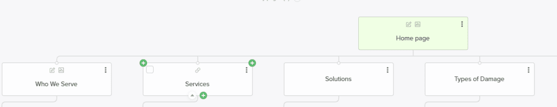
To ensure you properly organize your website, create a sitemap before you build it. A sitemap allows you to see the architecture of your website before it’s made, pinpoint relationships between pages, and identify any potential errors. Additionally, emphasize your offerings when prioritizing what to put on your main navigation. Both search engines and users tend to read navigation bars from left to right and expect to see the most important information on the leftmost part of the navigation bar.
#4 Incorrect Use of Color
Colors not only influence emotions but also play a crucial role in accessibility. Poor color contrast is a significant accessibility issue. Think about any time you’ve had to put in eyedrops after visiting a website with a bright yellow background and black text. Low contrast between text and background colors can also pose challenges for individuals with visual impairments or color vision deficiencies, preventing them from consuming content effectively.
When choosing your color scheme, consider your branding, its aesthetics, and its potential readability. Ensure there is sufficient contrast between text and background colors. The best solution is to work with an experienced website design company. However, you can also install and use accessibility tools like ANDI to identify potential accessibility issues with your color scheme.
#5 Lack of a Clear Call to Action (CTA)

Your website should present a guided journey for your target audience. How do you want them to navigate your website? Do you want them to browse your products? Schedule a demonstration? Sign up for a free trial? No matter what the call to action (CTA) is, it should be as clear as possible on your website. CTAs should be short, compelling, straightforward, and highly visible on your homepage. Avoid using multiple CTAs when possible—think about your top-priority goal, and write a CTA that helps you achieve that goal.
If you’re not sure what your CTA should be, work with a digital marketing team. Many digital marketing agencies have A/B testing tools available. With these tools, you can test multiple CTA options in a test environment with real website users without changing anything on your website.
#6 Not Having a Mobile-Friendly Design
Did you know that there are 4.97 billion active mobile Internet users worldwide? It’s true! Mobile internet traffic comprises 58.5% of total global online traffic, according to Statista. Mobile devices could include everything from smartphones to tablets and iPads. No matter what device your readers use to access your website, they should have a good experience.
This is why designing a responsive website is so important—a website with a responsive design will automatically adjust based on the device an individual uses to access the Internet. A website that isn’t responsive will often cut off important text, shift images, or make it hard to access certain elements, like buttons. You can read more about the importance of responsive web designs here.
When building your website, always test how the website looks from multiple devices. You can use Google Inspect (F12) or tools like BrowserStack to test the design.
#7 Not Building Credibility
Why should your potential buyers pick your company over other brands? If you don’t have the answer to this question, you need to consider it before building your website. Build up a portfolio of case studies, success stories, and testimonials you can showcase on your website. Potential customers want to know more about your brand and if you’re a business they can trust—show them why your company is the best choice.
#8 Using Too Many Stock Photos

Nobody likes being catfished. When you’re presenting your brand, use authentic visuals. Although stock imagery will not negatively impact a website’s SEO, it may affect your brand’s credibility and trustworthiness.
A remodeling company should never have a gallery of stock photos in its portfolio, nor should an e-commerce business use stock photos to represent its products—your photos should represent reality.
Adding pictures of your team throughout your website is also a great way to incorporate a human element into your business and build trust with your audience. Many first-time customers want to know who they’re working with before they request quotes or consultations.
Of course, there are always some use cases for stock images, but high-quality, first-party images should always be the goal. During your website build, take as many pictures as possible—you don’t necessarily need to hire a professional photographer, as most smartphones can take high-quality images in the right lighting.
#9 Not Having the Right Information
As mentioned in earlier sections, there are different questions you should consider during your website project. Your website isn’t just a website—it’s a mirror of your brand. What story do you want to tell?
When starting your project, especially if you are working with a professional designer and developer, you should have the following information ready to present:
- Your Business Objectives & Website Goals (More leads, more sales, etc.)
- Your Ideal Target Audience & Target Locations
- Key Differentiators (Why should potential customers trust you?)
- General Branding Guidelines
- High-Quality Images
- A List of Priority Products or Services
- Inspiration Websites
- Potential Target Keywords
- Frequently Asked Questions (Optional, but having an FAQ on your website can help improve lead quality)
- Testimonials & Certifications to Display
#10 Trying To Do Too Much on Your Own
Building a website requires a lot of time and collaboration between web designers, developers, content creators, and project managers. Each member plays a crucial role and brings a unique skill set for the various aspects of website creation, including design aesthetics, user experience, technical functionality, and content relevance—there’s simply no way you can handle every aspect of a website build project on your own, even if you have some design experience and a knack for multitasking.
If you don’t have an in-house team to supervise this type of project, you should work with a professional website design and marketing company. Outsourcing this project saves time and resources while allowing you to focus on your core operations.
Start Your Website Project Off Right With Help From Momentum
Unless you have experience building and developing websites (and, no, creating web 1.0 HTML websites as a teenager doesn’t count), working with a professional is always recommended. Truthfully, so many challenges and obstacles can pop up during a new build or rebuild project. When you have a professional by your side, these challenges and obstacles start to feel less impossible to overcome.
If you’re thinking about building a website or rebuilding your existing one, let our team at Momentum help you. We’ve been building responsive websites for businesses in many industries since 2010.
Visit our website to see some of the work we’ve done over the years, or contact us today to schedule a project consultation.