What Is Responsive Website Design & Why Is It a Must-Have in Today’s Digital World?
In today’s fast-moving digital landscape, having a website that seamlessly adapts to all devices and screen sizes is critical. We’re talking about responsive website design—a versatile method that ensures your website looks and functions perfectly, regardless of the devices your visitors are using.
So, let’s delve into what responsive website design entails, why it’s a game-changer, and the potential drawbacks of not embracing it.
What Is Responsive Website Design?
A responsive website is akin to a digital shapeshifter—they are adaptable and mold themselves to the screen they’re displayed on. Whether it’s a spacious desktop monitor or a compact smartphone screen, responsive design ensures your website adjusts its appearance and functionality accordingly. It’s like having a site that effortlessly blends in with any device.
Why Having a Flexible Website Is a Smart Move
Responsive website design serves as a Swiss Army Knife for your online presence, offering numerous benefits, including:
- Exceptional User Experience: With a responsive design, visitors can navigate, read content, and flawlessly interact with your website on any device without encountering glitches like distorted visuals or tiny, unreadable text.
- Search Engine Love: Major search engines, like Google, favor responsive websites and give them a higher ranking in search results. This translates to increased visibility and more traffic heading your way.
- Accessibility Champion: Responsive design ensures your website is accessible to individuals with disabilities who rely on assistive technologies.
- Cost-Effective: Maintaining a single responsive website proves to be more cost-efficient than managing separate versions for desktop and mobile because it cuts down on development and maintenance costs while simplifying content updates.
- Future-Proofing: Responsive design can seamlessly adapt to new devices and screen sizes without requiring a complete website overhaul. It’s like a built-in future-proofing mechanism.
What Happens If You Don’t Hop on the Responsive Train?
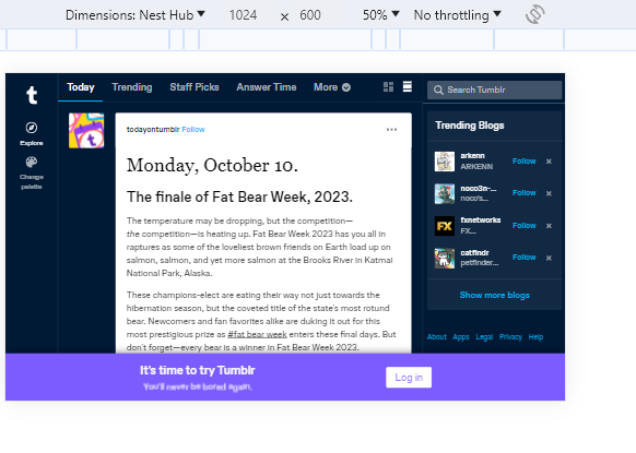
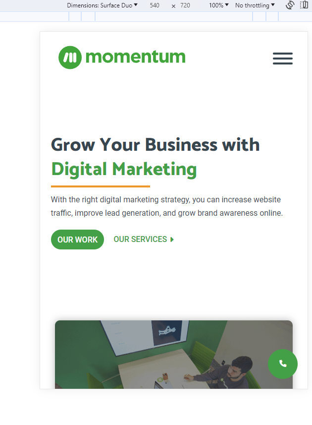
The pictures above showcase an example of a design that’s not responsive. The view from the left is from a Pixel 5, while the view on the right is from a Nest Hub—notice how certain website elements disappear entirely on the Pixel 5 view. A responsive website would have adapted to the two different screen sizes without making certain elements shift or disappear.
Not implementing a responsive website design can lead to unfavorable outcomes, such as:
- User Frustration: Visitors are likely to abandon a site that poses usability challenges on their device, so high bounce rates and diminished user engagement become the norm, which isn’t good for search engine optimization (SEO).
- Missed Mobile Traffic: In a world where mobile devices reign supreme, not being mobile-friendly equates to missing out on a substantial portion of potential visitors.
- SEO Setback: Search engines tend to penalize non-responsive sites, resulting in a drop in search engine rankings. This adversely affects your site’s visibility and organic traffic.
- Lost Opportunities: The E-commerce landscape is thriving, and users frequently make quick decisions on their mobile devices. You’re missing out on mobile conversions and sales by not having a responsive design.
- Brand Image Suffers: A clunky website reflects negatively on your brand’s image. Visitors might perceive your business as outdated or unprofessional, which can harm your reputation.
In a nutshell, responsive website design isn’t just a nice feature—it’s an absolute necessity. It delivers a consistent and enjoyable user experience, bolsters your SEO efforts, and ensures the longevity of your online presence. Neglecting it can result in missed sales opportunities, reduced traffic, and a tarnished brand reputation.
Get Help Building Your Responsive Website
If you need help developing a responsive website for your business, turn to Momentum. We’ve been building fresh, modern websites since 2010, helping businesses from nearly every industry transform their online presence, and we can do the same for yours!
Check out our case studies to see some of our past projects, or contact our expert development team today to set up a consultation for your new website.