Best Practices for Designing Interactive Elements on Websites
One of the primary goals of a website is to capture and maintain user attention. One strategy web designers use to achieve this goal is implementing effective interactive elements.
Although interactive elements can provide many benefits, including user engagement, they can also have downsides. Think about any time you’ve visited a website and dealt with that one pop-up ad that won’t go away. That was pretty annoying, right? This example is exactly why businesses need to really think about the interactive elements they put on their websites. While it may have seemed like a good idea in hindsight, all it did was make users want to leave the website.
This guide will cover the importance of interactive designs, effective design principles, and what to avoid when designing interactive elements.
The Primary Benefits of Good Interactive Design
User Engagement
Interactive design can lead to high user engagement. Interactive designs invite users to engage, explore, and stay awhile. This extended engagement is a powerful factor in boosting your website’s search visibility and, consequently, its ranking.
Brand Connection
Beyond functionality, interactive design establishes an emotional connection. Consistent, well-crafted interactions build a brand image that users can relate to and remember.
Types of Interactive Elements
Buttons
This is the most common type of interactive element. On websites, they’re generally paired with calls to action (CTA), which invite the website user to take some sort of action, whether it’s requesting a quote, scheduling an appointment, or downloading a brochure.
When you’re designing buttons, follow these best practices:
- Uniformity: In the same way you would use the same font or color in a book, you would do the same for website buttons. Users will be disoriented if the homepage features dark blue buttons with white text and the services page features red buttons with white text. Ideally, the colors you choose for your buttons should align with your branding.
- Contrast: Choose your colors wisely. Staring at black buttons with yellow text is akin to looking at the sun—nobody wants to or should do it. You can view this guide for more information or download ANDI, a browser extension that can help you catch potential accessibility issues.
- Specificity: If I just told you to “click here to start a download,” would you do it? Maybe you would if you really trusted me, but you don’t know me, so I think the likely answer is “no.” Expect the same reaction from website users. People visiting your website want to know exactly what they’re downloading or clicking on and what information they’re accessing.
- Length: Keep your button CTA short and sweet while still being specific. For example, if you want the user to click on a button to schedule an appointment or consultation, the most obvious CTA would be “Schedule an Appointment” or “Book Your Consultation.” The reader knows that if they click this button, they will be on their way to scheduling an appointment or consultation.
Links
Next are links, which are basically buttons but not as visually interesting. Most websites should have an internal linking strategy—this helps establish a customer journey (or how users should experience your website) and helps Google and other search engines understand how the information on your website is connected.
When you’re placing links on your website:
- Ensure Visibility: Does the anchor text (clickable text) look like an actual hyperlink, or does it blend in with the rest of the content? The user should understand that this is something they need to click on—usually, this is done by underlining or bolding the text or choosing a slightly different color.
- Be Specific: Similar to buttons, the anchor text needs to be clear. Why should the reader click on this link, and what will happen when they do?
- Understand Intent: If you’re publishing an informational blog, remember that the reader is just here to learn—they’re not ready to buy your product or services yet. Unless you invite them to learn more about your product or service and it’s related to some problem or situation described in the blog, don’t immediately link pages or other content pieces with a more high-intent or sales-y nature
- Avoid Too Many Links: Having five links back-to-back isn’t just overwhelming for readers—it can come off as spammy and potentially confuse search engines, too. Remember, internal links are about establishing a journey.
Videos
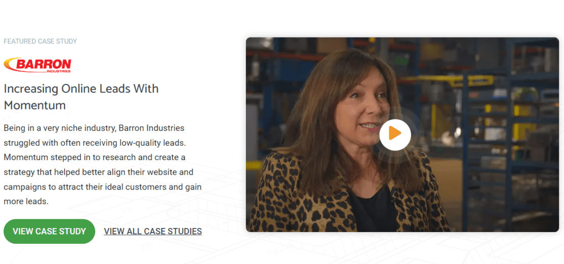
Videos can be an exceptional interactive element to add to your website, but they come with a cost: page speed. While you can use videos to show how your product works or showcase a customer testimonial, sometimes their size can cause your website to slow down, impacting user experience and potentially resulting in ranking issues, too. You can combat this issue by compressing videos, which reduces file size without sacrificing video quality.
In addition to video compression, you should follow these practices:
- Post Your Video on YouTube or Another Hosting Platform: When you upload a video to YouTube, Vimeo, or another platform, you can embed it on your site. This can reduce load times and bandwidth usage on your server.
- Enable Lazy Loading: Lazy load means that the video will only load when it’s about to come into the viewport. This also improves page load time and overall website performance.
- Provide Controls: Give users control over the video playback, including play/pause buttons, volume control, and a progress bar.
- Offer Subtitles & Captions: This practice is essential for improving accessibility. This isn’t just critical for individuals who are deaf or hard of hearing but also important for users in sound-sensitive environments.
- Never Enable Autoplay: Autoplay is startling for many people. I remember being on MySpace and throwing my headphones off after Metallica played directly into my ear at 95 decibels (a slight exaggeration). If you do enable Autoplay, help your website users out and mute it. They can choose to increase the volume if they want to.
- Ensure Its Relevancy: Video content can be effective, but only when it’s used correctly. If you’re creating informational content explaining the general types of roofing systems, it won’t make sense to have a promo video in the blog post highlighting the benefits of a manufacturer-specific roofing system.
- Don’t Overuse Videos: While it’s okay to have a photo gallery, don’t have a video gallery. This is going to impact page speed and be overwhelming to website users.
Maps
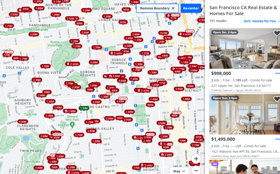
Maps can be a great tool if you have multiple store locations or if you’re a real estate agent and need to show listings. You can also use them to help website users understand how to get to your location/plan their route.
Incorporating a map onto your website is fairly straightforward and hard to get wrong. However, there are some factors to keep in mind:
- User Experience: How will the reader interact with your map? Provide zoom controls, draggable features, and clear location markers. If it’s a store locater, consider incorporating a search function where users can enter their zip code and find their closest location.
- Responsive: The map should appear the same on your page across all devices. This is called a responsive design. So, if a user visits your website from their iPhone and another one visits from their PC, they should still see the same map. Without a responsive design, users might notice the map getting cut off, or some of the features may be more difficult to use.
Additionally, the script for maps (especially Google Maps) is pretty large and can slow down the website, so unless users are actually interacting with the map on the page or if you have a lot of foot/retail traffic, it’s usually better to use an optimized image and add a Get Directions link that takes users to the Google Map URL offsite.
Forms
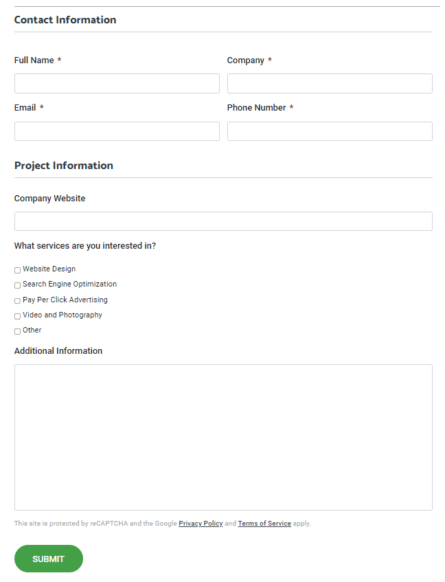
Nearly every website incorporates a form in some way to track leads, an important key performance indicator (KPI) for many businesses.
There aren’t really a ton of best practices for forms other than the following:
- Design Consistency: The color (and contrast) of the form should match the rest of the website (and ideally incorporate branding).
- Have a Clear Call to Action: What is the form for? If it’s to request a quote, the CTA should be at the top of the form, clearly indicating to the reader that they need to fill out the form if they want to request a quote.
- Keep Fields Minimal: Users don’t want to take the SAT when they visit your website, so keep both required (and not required) fields minimal. Limit it to name, address, and phone number (and/or email) (NAP) information, and go from there. If, for whatever reason, you need your form to have more than 10 fields, divide it into multiple steps and use progress indicators to inform users how far they have completed and how much is left.
- Implement Autofill: This function can be a timesaver for users, especially when it comes to NAP and credit/debit card information.
- Use CAPTCHA or Honeypots: These security measures are important to reduce spam and ensure higher-quality leads.
- Follow-Up Message: After a website user submits a form on your website, they should receive a message that confirms their message has been sent—this will help avoid potential confusion and multiple submissions from the same person.
What to Avoid
Page Speed Issues/Performance Impact
If you’re interested in search engine optimization, website speed should always be a primary focus. Page speed is part of Google’s Core Web Vitals, a set of metrics that help determine user experience, and is a significant ranking factor for Google.
So, whenever you design interactive elements, always keep that in mind. If you can’t find a way to optimize the element so it doesn’t impact page speed…is it really worth having on your website?
Excessive Animation
While animations can enhance engagement, they can also overwhelm users. I remember visiting a pest control company’s website and being immediately freaked out by some animated spiders crawling around in the background. No thank you. This is a great example of excessive animation—the crawling spiders didn’t serve any purpose on the website, other than inviting the user to leave it so they don’t have to see the spiders anymore.
Although we didn’t discuss animated elements in detail in this blog, if you decide to incorporate them, do it without distracting from the core content. A good example might be an eCommerce website where the cart icon or ‘Check Out Now’ button occasionally jiggles after a user adds something. This draws the website user back to the icon and helps remind them to check out.
Inconsistent Cross-Browser Compatibility
Ensure a consistent experience across browsers. Test interactive elements thoroughly and address any compatibility issues that may arise. This ties in again with responsive design—no matter how website users access your website, they should all have the same experience. If you’re curious about responsive website design, you can read this article for more information.
Get More Design Advice Today
Building or redesigning your website isn’t easy, especially if you don’t have an in-house design and development team. If you don’t know where to start, let Momentum help you. Founded in 2010, we’re a digital marketing agency dedicated to helping businesses across the United States through our website design and development and search engine optimization services.
Visit our blog for more website design resources, or contact us today to schedule a web design consultation with one of our experts.
Writer’s Note: Zan Moinet, Momentum’s Lead UI/UX Designer, and Anthony Holcombe, Momentum’s Digital SEO Strategist, contributed to this article.