What Is the Hero Section of a Website?
There’s arguably no section more important on a homepage than the hero section. The hero appears on the top of the homepage—it will be the first section a visitor will see, and it’s your best chance to convince a visitor that they should work with or purchase goods from your business.
What Basic Elements Are In a Hero Section?
- Short Headlines
- Call to Action
- High-Quality Media
Typically, you’ll see a bold, large headline with a clear call to action. This headline needs to be short and to the point. If you need to provide more detail, you can include a short description, but it’s best to keep this description under two sentences.
The hero section is also the ideal location to include your best media files. Whether it be photos, video, or some combination of the two, the hero section needs to showcase your goods and/or services in a way that makes the reader stop what they’re doing and take action!
If you don’t have high-quality media, you should consult with a professional photographer or use a stock imagery library like Adobe Stock or Shutterstock. However, when it comes to images you use on your website, it’s always better to utilize original photos and videos because stock images are easily identifiable and can be misleading to your customers.
Utilize Trust Builders When Possible
Beyond bold headlines, clear calls to action, and high-quality media, there are some additional elements you can include in your website’s hero section, including trust builders.
Trust builders are design elements that will help ease any concerns a visitor might have about the quality of your products or services. You can include certifications, awards, or even real-life testimonials.
In fact, recent research by Wyzowl “found that nine out of 10 people trust what a customer says about a business more than what that business says about itself. As a result, customers are likely to spend 31% more with a business that has good customer testimonials.”
Additional Design Tips
- Turn your calls to action into buttons. Display no more than two buttons in your hero section. Be sure this button stands out, but don’t get carried away.
- Don’t overthink your calls to action. You can utilize A/B testing to experiment with various calls to action to see how users respond to them without changing your website.
- Avoid including too much text. As stated before, you want the title and description to be short and to the point.
- Avoid using infinite animations, like bouncing buttons or flashing colors. These can seem like a great way to grab visitors’ attention, but they typically cause visual overload and can even slow down the loading speed of your site.
- Keep it simple. The less time it takes to scan this section, the more likely visitors will take action or continue exploring your site.
Example Hero Designs That Could Be Improved
To help you during your design journey, here are a few examples showcasing hero sections that could be improved.
Example #1: No Call to Action
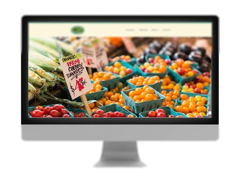
Although the hero section utilizes a strong image, it has no text or call to action. This is a missed opportunity to advertise upcoming events for sponsors, buyers, and/or vendors.
Example #2 Fast Slider
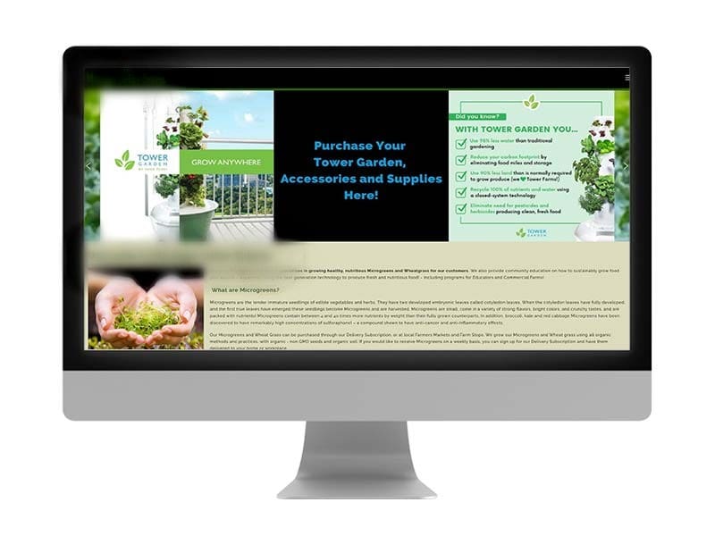
The image contains text, which isn’t great because search engines cannot crawl the text. This site also features a fast slider. Sliders can already cause slow loading speeds, but when the speed is set this high, it’s a user experience issue because the user will not have time to read what is on the slider. Lastly, there is no call-to-action button to guide the user.
Example #3: Difficult to Read/Too Much Text
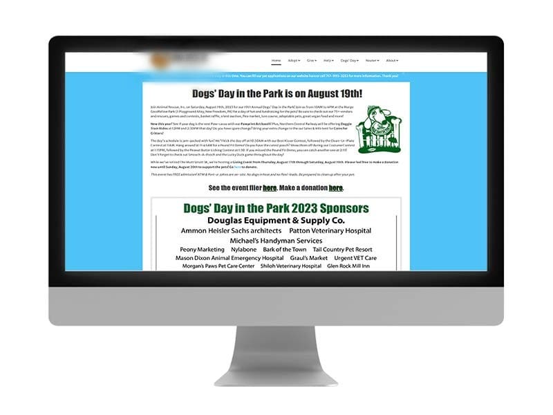
This hero section is just a block of text with a small graphic. There is too much to read here, and the call to action is difficult to find due to the low contrast of color (light blue text on a white background).
Good Hero Design Examples
For design inspiration, here are some of our favorite hero designs we’ve created.
Example #1: Engaging & Visible
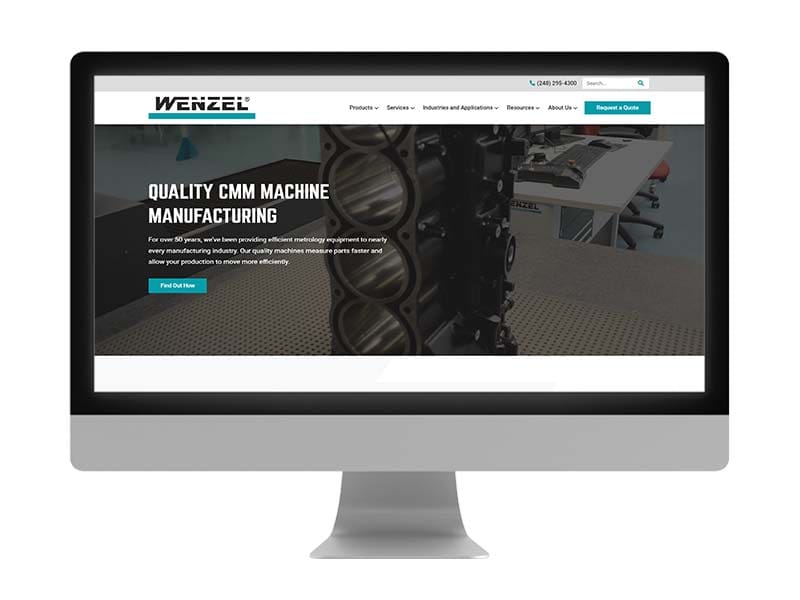
The background video in this hero is engaging and showcases the company’s products and capabilities. The title and description are also short and easily scannable, with a button that stands out, giving the user a clear action.
Example #2 Shows Real People
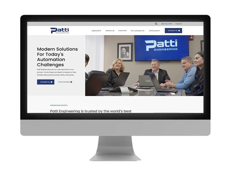
This hero design showcases the company’s capabilities and the people who work there, which is a huge trust builder. Your users want to see the people they will potentially be working with. The text on this hero is also short and easily scannable and features two calls-to-action links that stand out due to the high contrast of colors.
Example #3: Visually Interesting
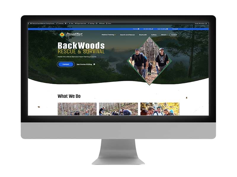
This hero uses a gorgeous backdrop image and includes pictures of real people participating in the company’s wilderness survival courses. The short text makes it easy to scan, and the dual calls-to-action links give users options to contact the company or learn more about their current courses.
Get Help Designing Your Website’s Hero Section
If you’re designing your first website, you should always partner with a professional web design agency like Momentum. We’ve designed and developed websites for businesses in many industries for over a decade.
View our portfolio to see some of our work, or contact us today to get started with a website design consultation.